NÅ – The Power of a Single Word
All pieces are in the dimensions of 20×20 centimeters.
Language is more than just words—it’s tone, expression, and the emotions behind them. The Danish word Nå is a perfect example. Depending on how it is said, it can express surprise, sarcasm, disappointment, or indifference. This series explores how one simple word can carry so many different emotions, translated into color, typography, and artistic expression.
No two interpretations are the same, just as no two emotions are ever truly identical.
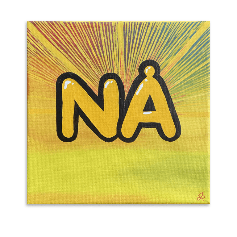
Overraskelse (Surprise)
A vibrant explosion of yellow radiates from the center, mirroring the unexpected nature of surprise. The bold, rounded letters with glossy highlights enhance the feeling of sudden excitement, like a spontaneous reaction to something unexpected. The warm hues and energetic…
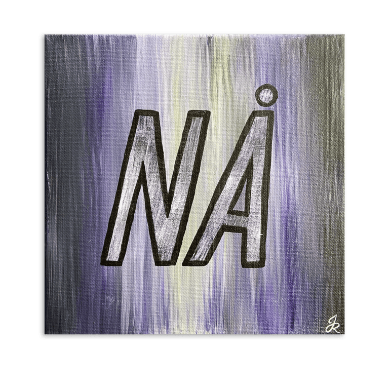
Sarkasme (Sarcasm)
A cold, calculated contrast between deep purple and muted tones sets the mood for sarcasm. The sharp-edged font, slightly distorted and outlined, mimics the way sarcasm often carries a subtle sting. The background, with its layered strokes, suggests complexity, sarcasm…
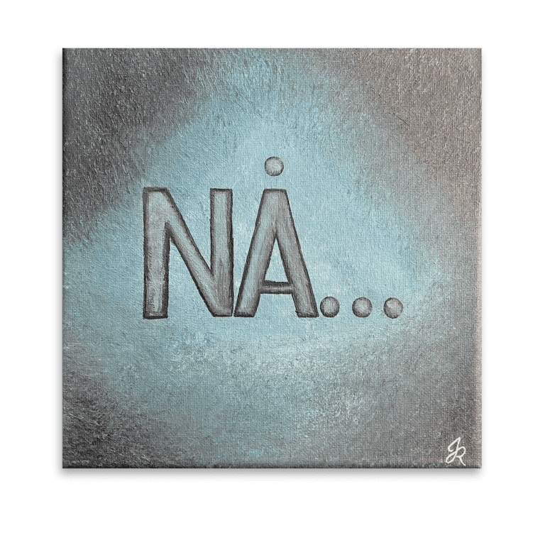
Skuffelse (Disappointment)
Soft yet heavy, the washed-out blue tones fade into a desaturated background, embodying the quiet weight of disappointment. The slightly faded, restrained lettering, followed by dots, suggests an unfinished thought—a pause where expectations were left unmet. The textured brushwork adds…
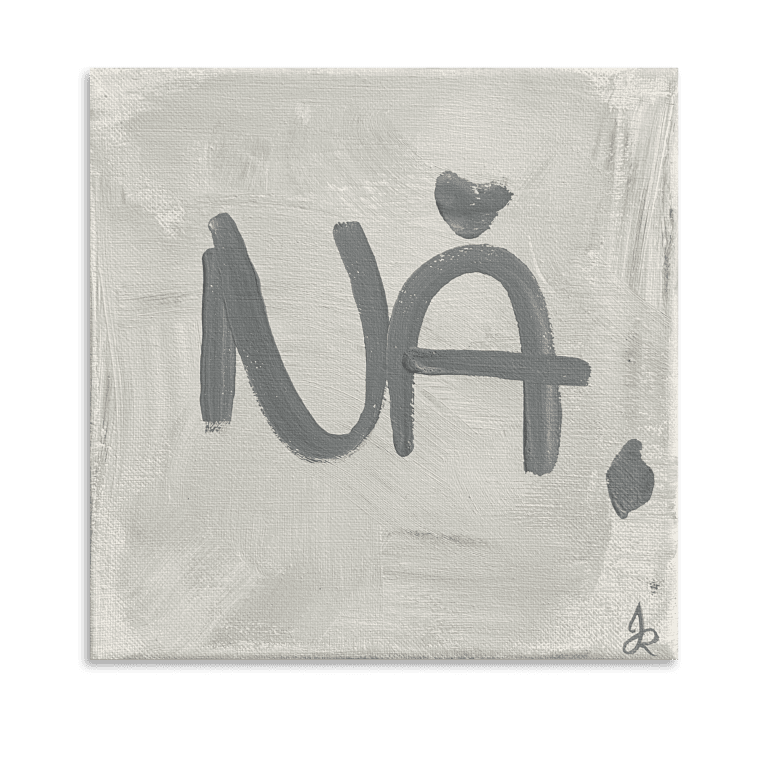
Ligegyldighed (Indifference)
Grey, flat, and unapologetically raw, this piece embodies the absence of strong emotion. The loosely painted letters feel almost careless, as if written with no real effort, mirroring the tone of true indifference. The uneven, spontaneous brushstrokes emphasize detachment,neither warm…
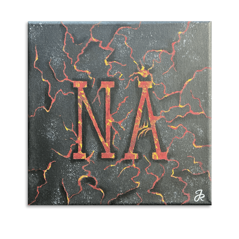
Foragt (Contempt)
Dark and intense, this piece radiates defiance and rejection. The bold, red typography appears fractured, as if cracked by the weight of disdain. Fiery veins of orange and yellow snake through the black surface, symbolizing suppressed anger, resentment, or outright…
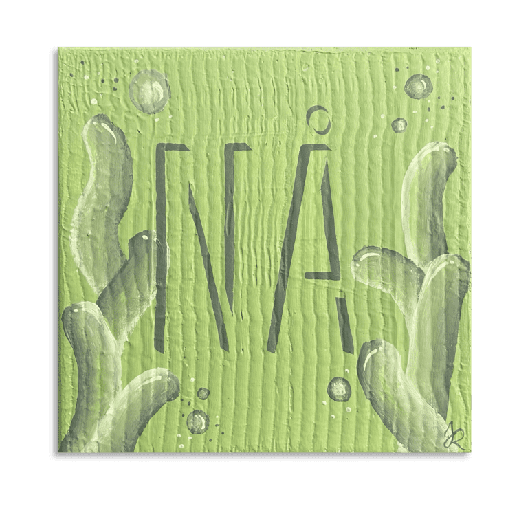
Undren (Curiosity)
Soft, fluid, and inviting, this piece embraces wonder. The fresh green tones, organic textures, and delicate bubbles create a sense of exploration, much like a question asked with genuine intrigue. The stretched typography leans forward, as if reaching for understanding. Nåexpresses…
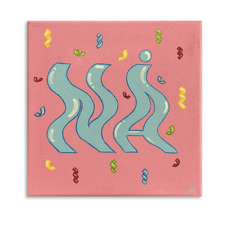
Latterliggørelse (Mockery)
A playful dance of colors and shapes, this piece exaggerates movement and lightness. The wavy, almost dancing typography floats against a pink background, surrounded by festive confetti. It embodies a teasing, humorous tone, Nå used to poke fun, to challenge, or to…
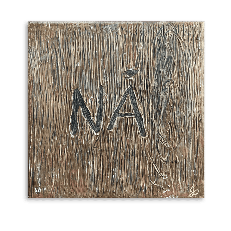
Tryghed (Comfort)
Textured, earthy, and warm, this painting embodies the security of something familiar. The soft brown hues and natural wood-like texture create a grounding presence, making Nå feel reassuring, like a gentle nod or a quiet confirmation. The typography blends into the surface,…
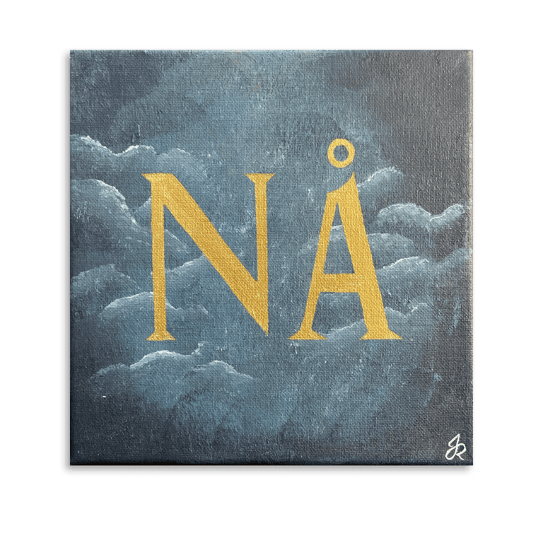
Melankoli (Melancholy)
Soft, deep, and reflective, this piece embodies quiet sorrow and nostalgia. The muted blue tones blend into wisps of clouds, as if drifting through fading memories. The golden typography stands in contrast, representing longing, a distant warmth, or a past…
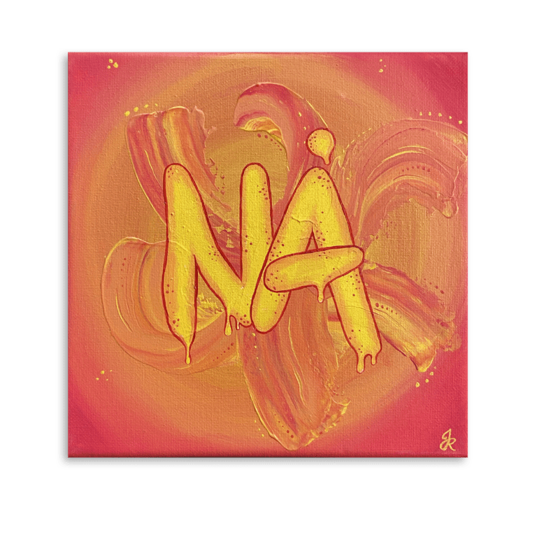
Eufori (Euphoria)
Explosive and alive, this piece radiates pure joy. The bright yellows and fiery oranges swirl and dance, mirroring the intensity of uncontainable happiness. The dripping, rounded letters vibrate with energy, almost bouncing off the canvas. Laughter, excitement, and the sheer…
